The first 15 times I watched Revenge Of The Nerds I was transfixed with the symbolism of the persecuted nerd: Like present-day rednecks, the nerd of 1984 represented one of the few remaining demographics where intolerance and ridicule were not only acceptable, but encouraged.
Of course, today's nerds are revered and adored (though our pompous self-promotion and narcissistic pretentiousness will ensure this will be short-lived) and the movie can be analysed on a more frivolous level: as the classic underdog-comes-good sexist flick that it is.
De-robed from its social significance, more subtle aspects of the film are able to flourish... like the suspect arrested for mopery - which they oddly defined as "exposing yourself to a blind person" when the actual definition is "walking down the street with no clear destination or purpose" (though sometimes expanded to "mopery with intent to creep" if it involves unsavoury characters).
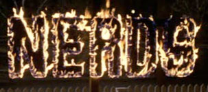
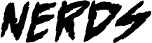
One detail that caught my eye on the latest viewing was the font that was chosen in the burning NERDS sign excellently constructed by the jocks. At first glance I thought it was surely Helvetica (though I really can only tell if something is Helvetica if I can see the little "tick" on the bottom of the uppercase R. Due to the flames, this detail was obscured)
I fired up photoshop and had a look. Kiiinda looked like it... I couldn't be sure. I thought I'd outsource the research to some top-notch designers, and get their opinions on the matter:
1. Henry henrytapia.com
When presented with the challenge (via email) he responded almost instantly with:
Looks like DIN Condensed to me but the R isn't quite right. Also DIN doesn't have the flames.
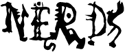
Indeed, DIN Condensed did look very close. "But the R isn't quite right". It's possible it could have been a band-saw mishap, so I took the DIN research to the 'net...
Based on a condensed style of DIN type family (Linotype Staff designers). That is a group of sans serif faces made to conform to the German Industrial Standard.
Designed at ParaType in 1997 by Tagir Safayev.
Hmmm. 1997. The movie predates 1997 by 13 years. Perhaps they were working on a version of it on the set of Revenge Of The Nerds, and it took 13 years to get the R right? Perhaps.
2. Stuart geeza.com.au
Also an almost instant reply:
There is one called block gothic. But not too sure, lemme look again.
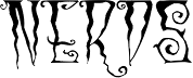
He then replied with an attached Open Type font called PreussischeIV44Ausgabe3. Which I couldn't find any information about, other than the meta-data in the font itself: Copyright (c) 2006 by Peter Wiege.
The font looked pretty close - wide S and everything. But I wasn't sure. I queried Stuart on the 22 year date discrepancy, to which he replied:
Well beggars can't be choosers, and you're a beggar....at least you smell like one
So that trail ended there.
3. Wade
Next, the guy sitting opposite to me seemed as good as any to ask. It turned out he had an avid interest in the subject (fonts, not Revenge Of The Nerds) and after studying the image carefully for a few seconds concluded;
I don't know, maybe Futura Condensed Bold. It's probably not even a font - someone's just made it up. Maybe.
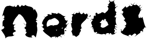
Futura Condensed Bold also looked close... R is wrong again, but the dates check out: Designed between 1924 and 1926 by Paul Renner.
4. Automated Font Detector... Go!
Finally, someone (annoyed with me asking the design team about fonts all day) suggested the cleverly titled What the Font? site, where you can upload an image and it will try and guess the font. They told me I'd have to trace the font in illustrator or something for it to work. Which I thought was ridiculous. What kind of computerised age do we live in?!
Here were some of the service's suggestions:

I feel the flames might have thrown the detection algorithm a bit. Still, no excuse for Military Patriotic P01.
I'm now looking for answers from you, the internet people. If we can't figure out what font this is then we're nothing but the nerds they say we are.
16 Comments
I love the dancing people font. Perhaps they are nerds on fire?
I live an work on the set of Revenge of the Nerds every day. I am the only person in our office that has even seen a Star Wars movie (any episode).
You all have it so easy mixing with yr kind :-)
I reckon that the production designer for the set would have looked at a typeface – perhaps one your nerds have suggested – and then gone on and just made the thing by hand. So it’s probably not a ‘real’ font at all.
Perhaps we have to track down this person and find out what actually happened!?
ROFL! I like how your results from Whatthefont came up with! Absolutely hilarious! As for what font that is…I’m not too sure. I might ask a client of mine as he’s pretty good at detecting font types. Hopefully we find the answer to your quest soon!
Your approach to this problem is absurd. You’re talking about ~1984 here. Does that year ring any bells? It was the year that the mac was first introduced. Before that, there was not really such a thing as a “Digital Font”. Not for normal humans, anyway. The font technology available at the time was either metal type, or photographic reproduction. Desktop publishing didn’t exist. In the world of photographic publishing, a font would come on a small peice of film, and a typesetter would use a specialized machine to character-for-character expose a letterform onto a peice of photographic paper. If you were in a less cutting edge print shop, you may still be using a linotype machine. Advertisers and magazines had specialized artists that could draw the letters by hand, in such a way that would be sensitive to a particular composition- for headlines and other large type.
If you wanted a sign, your first step certainly wasn’t going to be exactly, “Pick a font”. You would go to a sign maker. They would have sign painters trained to use a broadedged brush, and produce high quality lettering by hand. The sign painters would be trained in a number of very familiar looking type styles. You can certainly produce “helvetica” by hand, if trained properly. For an example of this, see the movie “Helvetica”, but it’s not going to be exact reproduction.
What likely happened is that there was a sign painter trained to do a sans serif style type. They either worked out the outline for the jigsaw from memory, or they painted the words onto the boards and sawed around them. The way a sign painter would have been trained is to be sensitive to the rhythm and balance of a particular composition and size. One inch high lettering in a particular style wouldn’t be quite exactly the same weight as 2 inch high lettering for example.
Since this is likely the case you’re never going to find an exact match, unless you make a new typeface yourself. This became a common pastime *after* the introduction of the mac, and the proliferation of desktop publishing. All the digital fonts you could possibly find, will have been created well after this movie. Some may be based on photographic or metal typefaces or sign styles, but digital type designers have learned to be sensitive to the needs of the digital medium- so digital versions are not exactly the same as the versions they’re based on.
WICKED BURNZ.
nice paraphrasing! “Gilbert Lowell: Their action tonight demands an immediate retaliation. And, if we don’t, we’re nothing but the nerds they say we are.”
If I’d known you were going to this level of detail I would have said “DIN 1451” which goes back to the 1930s but would have been equally as incorrect.
That piece of type says to me fun and personable. Is it MS Comic Sans?
@hank – i think it’s the vista version of comic sans: fun and personable and will burn you if you use it.
haha, thank’s breton – way to confirm my nerd-based “narcissistic pretentiousness” line!
So anyhoo, when the set designer on Revenge Of The Nerds accidently lands on this page, we’d appreciate it if you would jot down a paragraph on the story behind the effigy. Thanks.
I agree with Breton. This is most likely the case. The sign writer may have had a particular font in mind however. After thinking Din, then possibly Akzidenz Grotesk Bold Condensed (the font we use here at Blue Cork) and maybe even Eurostyle, they all came up incorrect. Robust is close, but the one that fits the overall shape and proportion the best I think is ITC Machine. I know it’s got angled corners, but think about it… Released in 1970. The signwriter thought hey, that’s a nerdy font, I’ll make a sign with that face! The director then sees the sign and says “That’s too nerdy. Can you round off those ridiculous angled edges?” and that’s how the nerd font definitely maybe came about.
yeha brenton, as if fonts were invented by mac in 1984?! lol!
“yeha brenton, as if fonts were invented by mac in 1984?! lol! ”
Your deficit of literacy skills astounds me.
wow Breton, your a cok, i heard you ware chick’s undeez
Ahhh, lovely. On a more back-to-the-point note, I sent an inquiry (on the suggestion of @henrytapia) to @ilovetypography on Twitter. The result:
“…with such a poor sample, it could be anything. perhaps a mauled Eurostile Condensed (that’s been stretched/redrawn)”
And Eurostile Condensed indeed looks very close! What do you reckon?
Thats what i thought! Nevile Brody is a genius. Hooray!